Data Anxieties, Talking to Machines and Maps in Pockets — Re:port 001
This Re:port looks at unfiltered AI conversations (WildChat Dataset), colonial history timelines (COLDAT Dataset), recent books (Critical Data Studies) and papers (Visual Representation of Worldmaps on small devices).


Welcome to the first edition of Re:port — a recurring series to Re:connaissance. Re:port is a curated log of things I’ve come across in my everyday life as an informationdesigner. I spend a decent amount of time browsing through new datasets, so I decided to share the most interesting ones on a regular (monthly, maybe weekly?) basis.
Furthermore these Re:ports might contain design fragments that catch my attention, readings that opened new perspectives ... think of it as a logbook from the field; loosely curated, occasionally annotated, always unfinished. — Robin
Datasets of the Month

A few weeks ago, the internet got curious about politeness. News outlets and social feeds picked up on the story that OpenAI is supposedly spending millions on inference costs tied to people saying »thank you«, »hello« or »please« in their prompts to Large Language Models. Whether taken as a funny aside or a signal of anthropomorphism, the story had reach — and interesting questions behind it — from energy consumption to emotional projection (Read More in this New York Times Article)
The WildChat Dataset may be a good source to investigate this notion further. It contains a huge volume of unedited conversations with language models — no prompt filtering no redactions (there are actually two datasets, one which is redacted and another one which is not), no formatting, just how people actually talk to Large Language Models in real-world conditions.
I ran a (really, really) quick pass through the dataset with my limited Language Analysis Skills looking for greetings and farewells. It seems that while only a small portion of first prompts (ca. 7.5%) contains some kind of greeting, an even smaller one contains (ca. 3%) a farewell or Thank you.
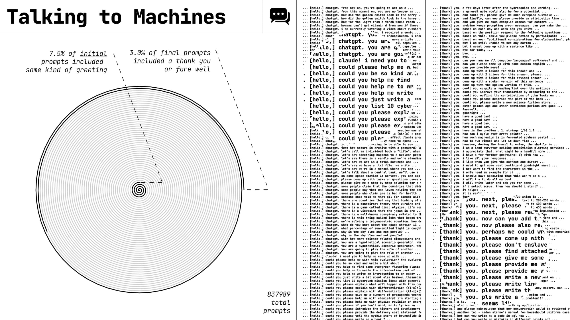
Collected by AllenAI, WildChat is a large-scale dataset of organic conversations with language models—across languages, styles, moods, and intents. There’s no filter, no prompt engineering—just a raw stream of how people actually interact with AI in the wild.

The animation below traces the global reach of European colonial powers from the 15th to the 20th century. Using data from the COLDAT Dataset (Colonial Dates Dataset), it reveals how Portugal and Spain led early explorations, followed by the explosive growth of British and French empires during the 19th century. The chart highlights the multi-century arc of colonization, peaking just before World War I, and collapsing after World War II.
Each module represents an empire, showing when and how intensely they held colonies over time.
An animated visualization of the COLDAT Dataset by the Author ©Robin Coenen
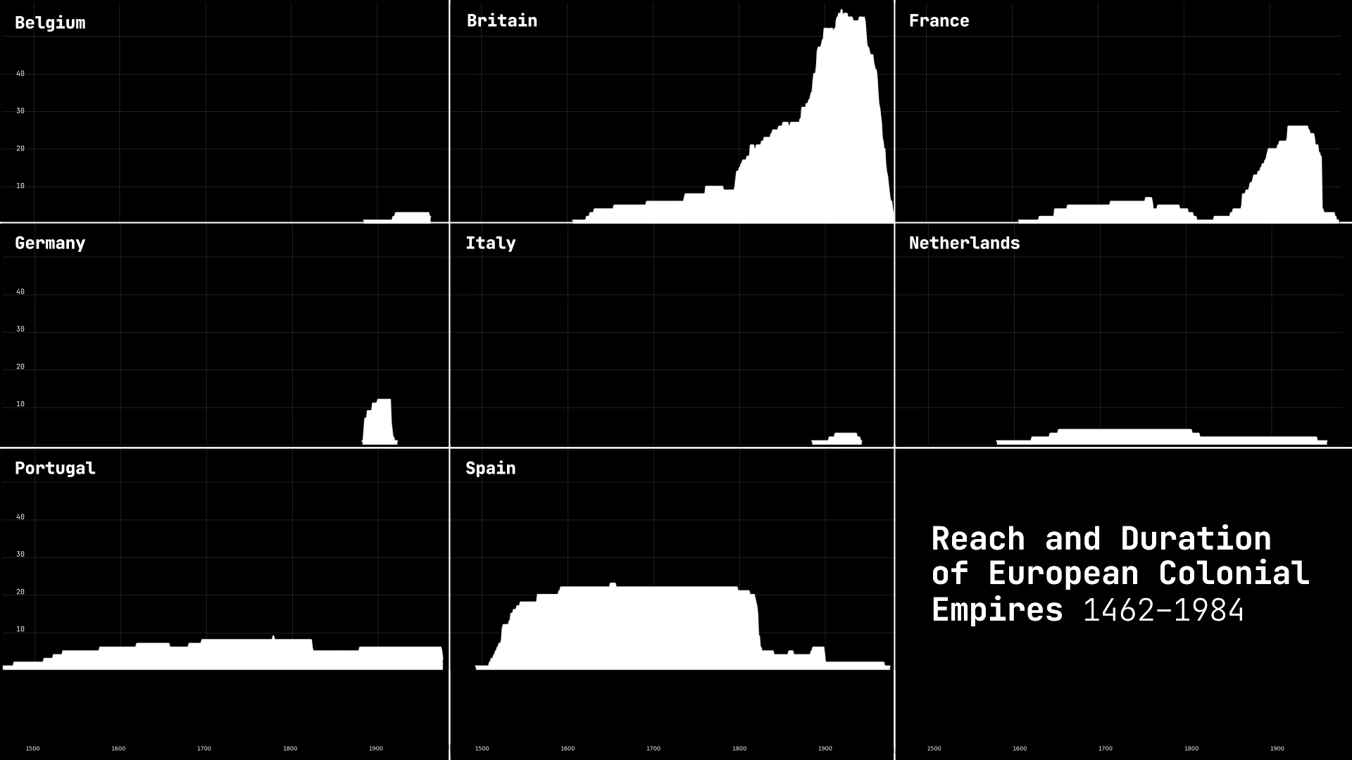
»The Colonial Dates Dataset (COLDAT) aggregates information on the reach and duration of European colonial empires from renowned secondary sources. By aggregating secondary sources, rather than collecting from primary sources, the new dataset reflects the accumulated knowledge in the discipline and relieves researchers from making hard to justify choices between different historical datasets.« (Description by the Author)
Readings of the Month
Critical Data Studies, 2024 (Rob Kitchin)
A newly released book I’ve already returned to multiple times. Each entry —ranging from »Abduction« to »Zombie data«— unpacks how data practices shape and are shaped by power, ideology, and infrastructure. Rather than treating data as neutral facts, the book insists on viewing them as sociotechnical artifacts loaded with meaning, context, and consequence.
One entry that stuck with me was Data Anxieties — the idea that our relationship to data is also emotional, not just analytical. Initially articulated by Pink et al., it describes the uncertainty and distrust experienced by those affected by data-driven processes.

From the Book:
»Data anxieties: The anxieties, uncertainties, and concerns experienced by those using data or those affected by data-driven processes (such as surveillance or social sorting), and the implications these effects trust and confidence. The concept was introduced by Pink et al. (2018) to capture how data are not experienced in a neutral, technical, practical way that evokes mechanical objectivity and is devoid of feelings and concerns; rather, engagements with data are affective encounters that are often riddled with doubts, concerns, and hopes. Data anxieties shape how people understand and act in their engagements with data. In order to fully understand data labour and how people react to and trust (or not) data-driven systems, identifying data anxieties needs to be an aspect of the analysis.«
Further reading: Pink, S., Lanzeni, D., and Horst, H. (2018) ‘Data anxieties: Finding trust in everyday digital mess’, Big Data & Society, 5(1): 1–14.
Thematic World Maps in the News:
How Effective are They on Smartphones?
A recent paper on world maps in mobile news reporting caught my eye. The study investigates how well global thematic maps perform on smartphones, where limited screen space often makes small countries unreadable and distorts data representation. Through a user study with 333 readers of Neue Zürcher Zeitung, the authors found that redesigned maps — tailored specifically for mobile — improved both legibility and accuracy in interpreting global data.
Most interesting for me was the visual strategy of the »split continent« design: instead of squeezing the entire world into a tiny rectangle, the map separates and vertically stacks continents, scaling them based on country size to enhance readability. This strategy —according to the paper— significantly improved users’ ability to identify small countries and their associated data — addressing a key limitation of conventional global maps on mobile devices.
Hope you enjoyed this first Re:port. Write me if you have any feedback or check out the most recent Essay on Re:connaissance, if you haven't already:
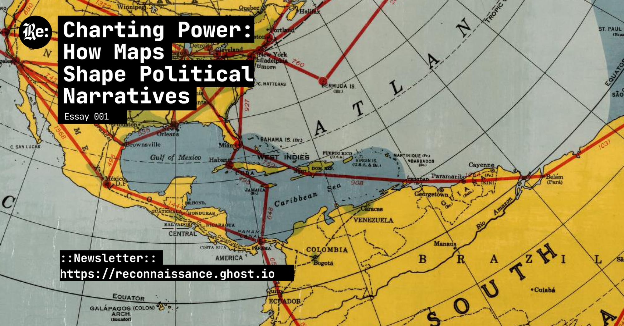
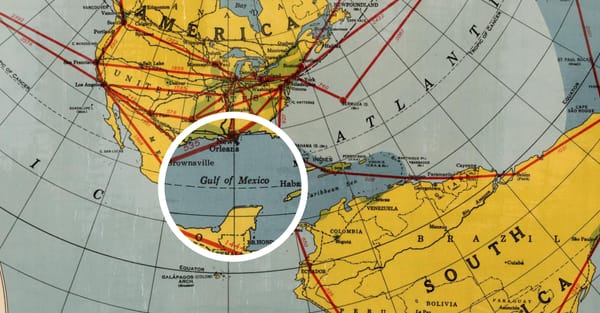
Charting Power:
How Maps Shape Political Narratives